Contact Us: 833-BRA-ND11

Omnipresence

Exeevo

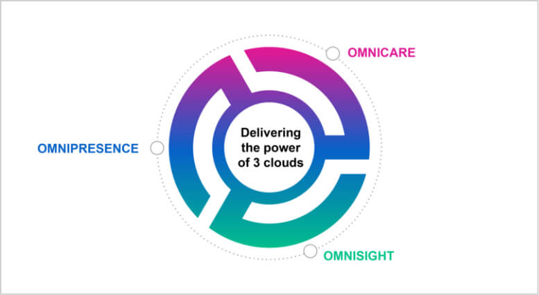
Omnipresence, a healthcare SaaS company, specializing in customer experience management recently experienced a period of rapid growth.

A common side effect of rapid growth is adding new capabilities and business segments often causing companies to outgrow their original corporate brand. In order to meet the needs of their growing customer base, and to continue giving their customers the best brand experience Omnipresence leadership engaged us to build a fresh, comprehensive corporate brand.

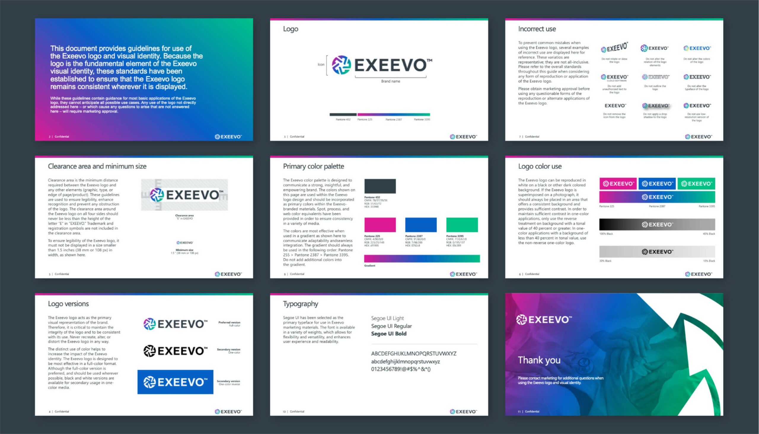
Starting with a creative kickoff that engaged multiple members of the team, armed us with beneficial background information, and the insights needed to build a powerful creative strategy. Building and maintaining trust in healthcare is critical especially across diverse audiences. The new identity needed to be concise, empowering and show strength. Through a strong collaboration with the Omnipresence team key benefits and a clear purpose were identified, which allowed for quick alignment among the decision makers on a naming direction.

  • Client

    Omnipresence

  • Services

    Verbal Branding
    Visual Branding


Name candidates explored the concepts of empowerment and strength, and avoided close ties to pharmaceuticals and fire which were used by competitors. Overtly created from experience, the new corporate name, Exeevo (ex – EE – voh) speaks to driving customer experiences forward with actionable insights and intelligence. Functionally, the name is short and thus has a strong presence.

  • Icon

    Multiple shapes come together to symbolize an all-in-one solution

  • Wordmark

    Simplistic text appears modern and refined

  • Name Prefix

    ‘Ex’ is overtly created from the word experience

  • Name Suffix

    ‘Eevo’ is easy to spell and pronounce

A unified, intelligent customer experience platform (CXM) should appear modern. Areas of visual opportunity for color were workshopped against a competitive set. No one wants to be confused with their rival, right? Pink, purple and green were chosen for their visual impact and confidence. Each of these blend together in a gradient in the logo’s icon to illustrate illumination. After refinement, multiple shapes came together in the icon to symbolize the all-in-one solution of Exeevo.


More stories only we can tell