One of the best things you can do for your brand? A website that meets the standards of accessibility.
Not only will it increase the size of your potential target audience, thereby providing a business benefit, but it will reinforce the importance of diversity by illustrating a concrete commitment to those ideals.
But it’s easier said than done. Creating a website that speaks to your brand while maximizing accessibility is a complex balancing act. But with a team of expert visual designers, we’re ready to help. We’ll create an ADA-compliant website that strategically aligns with your branding, leaving your brand with one of its greatest assets.
The importance of an ADA-compliant website
According to the CDC, more than 1 in 4 adults in the United States is living with a disability. That number includes a wide variety of the type and severity of disabilities. However, by taking a closer look, we can see that nearly 5% of American adults are living with blindness or have serious difficulty seeing. In truth, living with a disability can impact the way someone interacts with a brand in several ways. At its core, a brand is a relationship, after all. And a good relationship creates memorable experiences – experiences that include things like sights, sounds, sensations and mental stimulation.
In particular, sight is an essential component of visual branding, which brings us back to that 5%. 5% of the total population may face significant obstacles in experiencing your visual brand, and that estimate may be conservative. In addition to people with low or no vision, others have a color deficiency, also known as color blindness.
Balancing ADA standards with your brand
Fortunately, the use of color and how it is experienced by people with low vision can be subjectively measured. This means that, as brand designers, we can actually plan for these challenges and incorporate them into our creative process to create an ADA-compliant website. Thereby, we’re able to develop brands that are both aesthetically pleasing and inclusive of those who may struggle to see color in the way many of us take for granted.
The standard for how we measure the use of color on websites is set by the Web Content Accessibility Guidelines (WCAG), which documents how to make web content more accessible to people with disabilities. In terms of visual branding and color, the guidelines are primarily based on the contrast of brightness between two different colors. This ratio ranges from 1:1 (white text on a white field, for example) to 21:1 (black text on a white field, or vice versa) and is measured by the hexadecimal codes assigned to any given color (if you’re working with Pantone swatches, these hexadecimal codes are available for each swatch via Pantone Connect). Some color combinations, like black vs. white, are obvious in their contrast, but many others may not be. In fact, most color combinations you’re likely to find within a given brand color palette will fall well below the midpoint of that range.
Taking a closer look at the WCAG standards and how they’re measured, we can see that multiple levels or “grades” can be reached. Ideally, your website will reach WCAG’s AAA level, meaning that all text and interactive elements can be easily seen and read by users with low vision or color deficiency. Reaching the AAA level may not always be possible for all elements; if that’s the case for your brand, it’s still recommended that you reach the AA level to maximize the accessibility of your website. Whether you’re speaking to customers, business partners or investors, your audience will inevitably include people with low vision or color deficiency, and you don’t want to exclude them by ignoring a simple and measurable metric.
Measuring the accessibility of your website
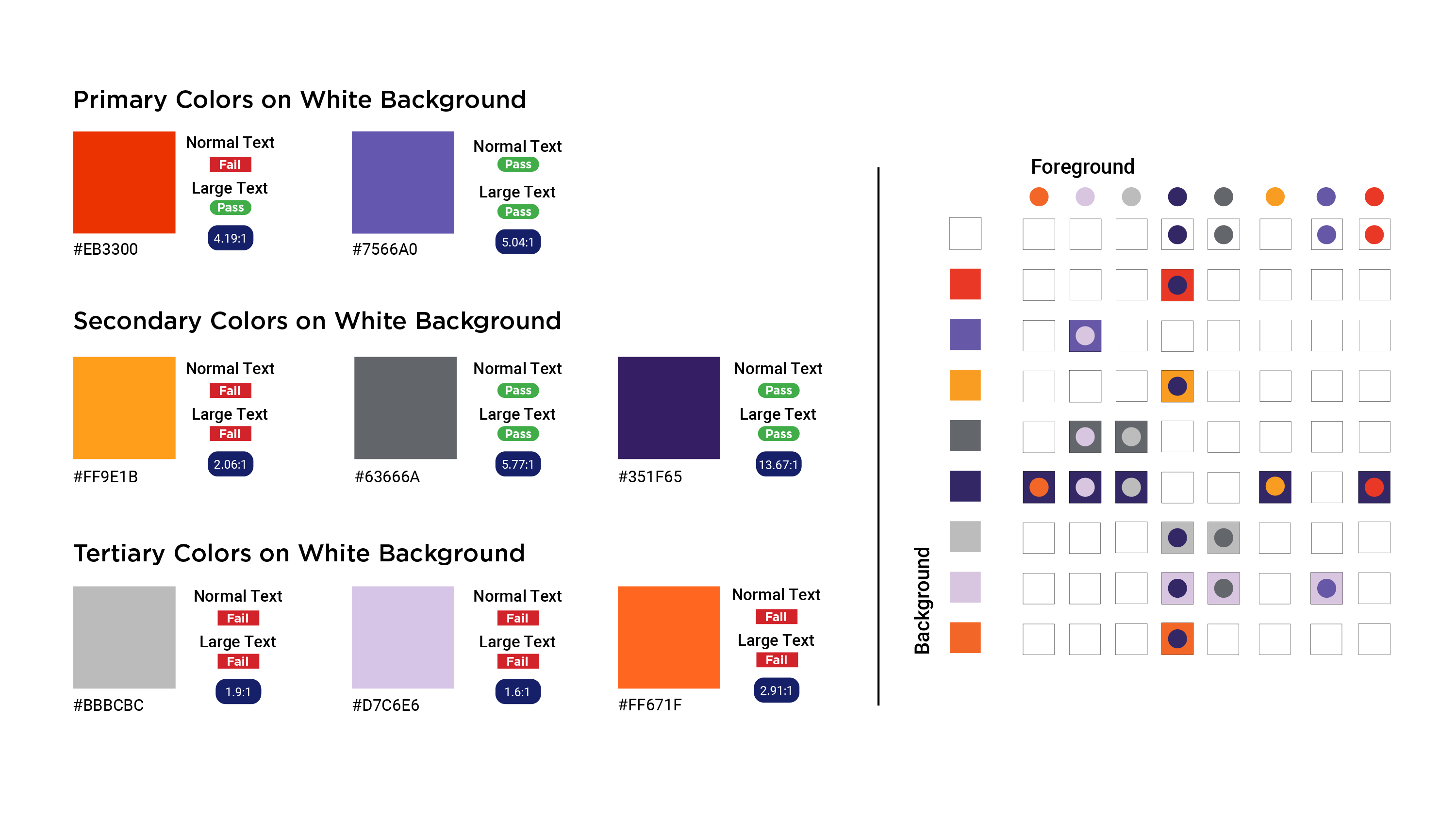
To measure the visual accessibility of your website, there are several different resources that offer tools that align with WCAG standards. Within these, you’ll be able to easily view how various color combinations from your brand’s color palette match up against both the AA and AAA levels. Additionally, these tools can provide a more detailed breakdown between normal text, large text, graphical objects and user interface components (such as buttons or other navigational elements).
The earlier you can bring these tools into the process of developing a brand color palette, the better. To help measure the visible accessibility of your color palette, consider creating a detailed breakdown of the potential color combinations you want to use for your website.
Below, the color compliance chart pulls in Addison Whitney’s color palette and breaks down how various combinations stack up to the standards of accessibility. The left side provides a pass/fail for text sizes against our primary, secondary and tertiary colors. The right side depicts the contrast between potential foreground and background combinations. Always having a chart like this on hand places accessibility at the forefront of your mind to ensure an ADA-compliant website.